#css keyframes animations
Explore tagged Tumblr posts
Visit Tumblr Blog
Explore Tumblr blogs with no restrictions, modern design and the best experience.
Last Seen Tumblr Blogs


Fun Fact
The most popular pages on Tumblr are about Minecraft, GIFs, and David J. Peterson.
Text
Animated Text
#css text animation#html css#learn to code#divinector#css#frontenddevelopment#html#css3#css keyframes animations#css text effects
2 notes
·
View notes
Text

Text Fill Animation On Hover
#text fill animation on hover#text animation#codenewbies#html css#frontenddevelopment#html5 css3#css animation examples#pure css animation#css animation tutorial#css#css animation snippets#html css animation#css keyframes animation
1 note
·
View note
Link
Exploring Web Animation: CSS vs. JavaScript
This article delves into the realm of web animation, exploring a wide range of techniques used to enhance the visual allure and interactivity of websites. The piece discusses the implementation of various animations using both CSS and JavaScript, highlighting the unique benefits each approach offers. While both CSS and JavaScript can achieve similar animation effects, the article suggests that, in most cases, using CSS is the preferred option due to its advantages.
The article delves into the fundamental concepts and practical examples of different animation techniques, such as transitions, keyframe animations, transforms, rotation and spin, scaling, fade in/fade out, and blinking effects. By showcasing how these techniques can be executed using both CSS and JavaScript, the article aims to empower designers and developers to make informed decisions about which method to choose for their animations. Additionally, the article emphasizes the recommendation to lean towards using CSS for animations, highlighting its benefits in terms of performance, simplicity, and consistent behavior across browsers and devices.
#web animation#CSS#JavaScript#transitions#keyframe animations#transforms#rotation#scaling#fade in/fade out#blinking effect
0 notes
Text
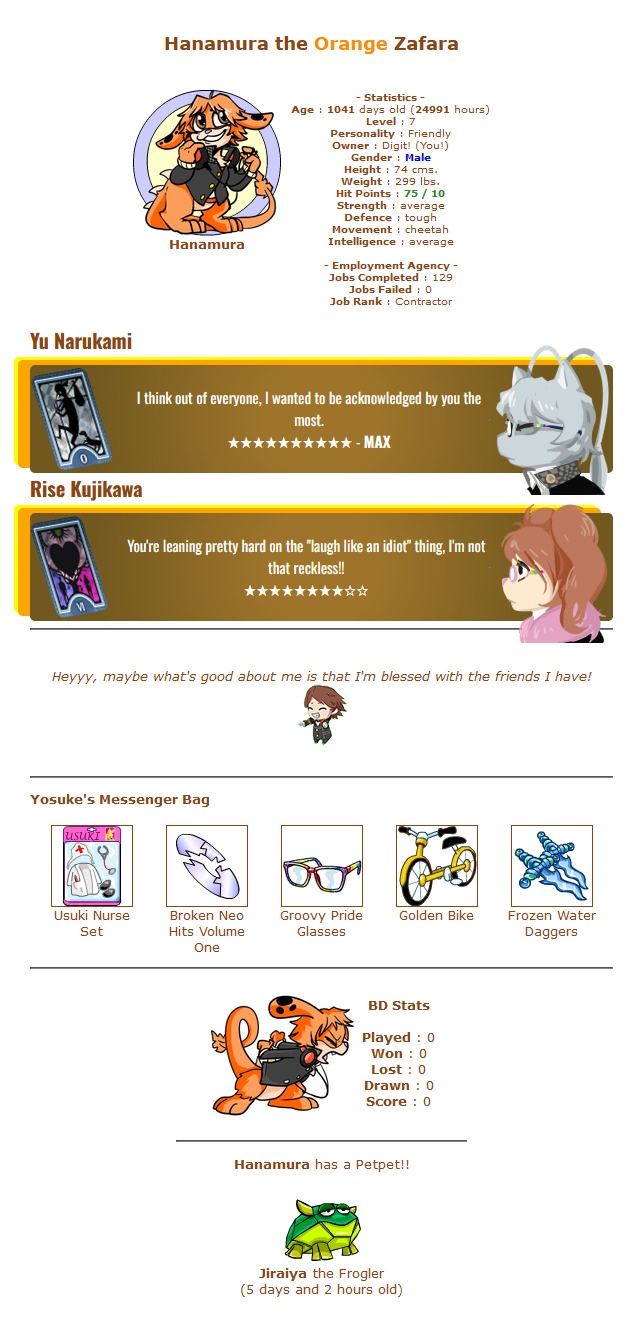
did a simpler layout for Hanamura, my zafara. Narukami and Risette are the only other ones currently associated so they're the only ones with social links. (clicking on the name takes you to their petlookups aaahh) also the tarots spin on hover because I can't get enough of keyframe animation apparently
its fun doing custom CSS and art for these guys
26 notes
·
View notes
Text

Day 2 - 100 Days CSS Challenge
Welcome to day 2 of 100 days of css challenge, where we will be together getting a given image result into reality by code.
We already know the drill since we did the first challenge, now let's get right into the different steps:
First step : Screenshot the image and get its color palette

No crazy color palette here, we only have two colors
White
This shade of green: #3FAF82
To make things more organized and get used to coding in an organized way, even if not doing it here wouldn't make any difference because we only have two colors, in more complex projects we would have a lot, we will define our colors at the beginning of our CSS code (well, only the green in this case):
:root { --main-green: #3FAF82; }
And this is how we'll use it whenever we want:
color: var(--main-green);
Second step : Identify the image elements
What elements do I have?
Three lines: line1, line 2, and line 3. I'll add them to my HTML starter template, again I'll leave the frame and center there:
<div class="frame"> <div class="center"> <div class="line-1 line"></div> <div class="line-2 line"></div> <div class="line-3 line"></div> </div> </div>
Third step : Bring them to life with CSS
Applying the background color
Only one line should be changed in the CSS code already added to .frame class:
background: var(--main-green);
So this is what we have going on for now :

Creating the lines
Now let's create our lines; if you noticed I gave each one two classes line-number and then line. I'll use the line class to give them all the common properties they have such as the color, height, width, position, border-radius, and shadow. And then I'll use the line-number to move them wherever I want using the left, top, right, bottom properties of an absolutely positioned element in CSS.
Let's start by creating all of them:
.line { left: -45px; position: absolute; height: 9px; width: 100px; background: white; border-radius: 10px; box-shadow: 2px 2px 5px rgba(0, 0, 0, 0.2); }
And just like this you'll see this in the browser:

You only see one line because the three are overlapping each other, and that's why we'll move each one of them exactly where we want using this:
.line-3 { top: 22px; } .line-1 { top: -22px; }
Now our static menu is ready:

Creating and analyzing the animations
As of observing, we can see that:
Line one goes down to line 2
Line three goes up to line 2
THEN line 2 disappears
THEN lines 1 and rotate to create the X
line-one-goes-down animation
This is my line-one code in the static version:
.line-1 { top: -22px; }
What I'm trying to do here is simply a movement translated by changing top from -22px to it becoming 0px:
@keyframes line-one-goes-down { 0% { top: -22px; } 100% { top: 0px; } }
line-three-goes-up animation
Again, I'm trying to go from top being 22px to it being 0px:
@keyframes line-three-goes-up { 0% { top: 22px; } 100% { top: 0px; } }
line-two-disappear animation
Making disappear simply means turning its opacity and width to 0:
@keyframes line-two-disappear { 0% { opacity: 1; width: 100px; } 100% { opacity: 0; width: 0px; } }
I'm gonna apply these animations and see what happens , before I create the rotation animations
.center.active .line-1 { animation: line-one-goes-down 0.5s forwards; } .center.active .line-2 { animation: line-two-disappear 0.5s forwards; } .center.active .line-3 { animation: line-three-goes-up 0.5s forwards; }
forwards means that the element will stay in the final state after the animation and not return to its original state.
This is what applying those three animations looks like:
Last but not least : let's Create the X
We only have to animations left for this: rotate-line-1 and rotate-line-2. Let's create them:
@keyframes rotate-line-1 { 0% { transform: rotate(0deg); } 100% { transform: rotate(45deg); } } @keyframes rotate-line-2 { 0% { transform: rotate(0deg); } 100% { transform: rotate(-45deg); } }
And that is my friends how we finished this challenge!
Happy coding, and see you tomorrow for Day 3!
#100dayscssChallenge#codeblr#code#css#html#javascript#java development company#python#studyblr#progblr#programming#comp sci#web design#web developers#web development#website design#webdev#website#tech#html css#learn to code
18 notes
·
View notes
Text
neocities heracles trials: from a chaotic newbie
okay so i want to actually start posting here and i finally got it through my thick skull that this is LITERALLY A BLOG. i'm supposed to blog. so here's a blog post.
anyways, for context, i've been working on my neocities for a while now, recently started over to make things more original and more me. another thing to note is that i'm using VScode.
the issue here is that i have zero well not exactly zero but i lack any professional/academic background experience with making websites. the html isn't the issue (thankfully) but holy shit dude...css+javascript implementation . basic styling with css is no biggie, right? absolutely, however...may i introduce: smooth transitions + the absolutely tragic fact that the <marquee> tag is deprecated an accessibility issue.
so, my first goal day one was to recreate a marquee animation through css. so i tried to simply implement this incredibly useful bit of code into my site (in which if you're interested i totally think my failure to get it working was user error so please check it out it works great if you're not me) but, lo and behold, despite me getting it to work in my V1 project, i could not, for the life of me, get it to work. so i, not too familiar with css animation and completely lost when it comes to javascript, started grasping at straws. i ended up finding this tutorial and, with some improvisation since the tutorial is for webflow and i'm manually writing everything, managed to make my own css recreation of a marquee effect essentially from scratch, and even learned about the animation-play-state css attribute so i could pause the effect when the marquee is hovered over! victory, basically.

then, i looked around the many cool and absolutely awesome sites on neocities to get inspiration, and then i was like "hey what if i made a custom button background image" and with some trial and error, made myself a pretty decent base (for now) with aseprite, and learned more about the program in the meantime which is always a plus.
then i decided that i wanted to do more with the buttons. i wanted to make it animate on hover. not too hard right? you'll...you'll see why i struggled...in a moment...
anyways, i settled on a simple shrink animation. which THIS i could do with ease, messed around a bit, got the keyframes, assigned that to the button:hover and all of that and all was good!...until i realized that once i stopped hovering over it, it snapped back to its original scale instead of transitioning smoothly again. THIS is where the "fun" began.
see, although i can wrap my head around things easily when it comes to css, i have to constantly look up what the proper syntax for everything is because otherwise i'll mess everything up. and through my research i had conducted (aka surfing through multiple blogs and reddit posts alongside other things on random forum websites) i had discovered the very neat transition attribute.
but we'll have to return to this because i have adhd, and i ended up getting distracted during this process. see, originally i had decided that the button would change it's visual to appear like it was pressed when the user's mouse hovered over it. then i was like "i don't think this makes sense" so i changed it so that the button wouldn't change its background image unless the user actually clicked on it. so i did that. then i had to make sure that the button wouldn't magically scale up again so i had to transform the styling and blah blah blah those details aren't really that important ANYWAYS the actual important bit about this is that if you use the transition attribute and there's a change in background images that change will also be transitioned unless you set the transition to only apply to a specific change. and i didn't know that originally. so every time i tried to fix things up with a transition so the button wouldn't snap back to it's original size out of nowhere the background would slooowly change as well and i actually got so frustrated with this that i wanted to burn something down because that's a totally normal reaction i guess. anyways, then i started frantically searching for answers on the topic and EVERY. SINGLE. THING. THAT I FOUND. INCLUDED JAVASCRIPT.
i do not know javascript. i have not learned anything about it unlike css and html. it SCARES me and it is FRUSTRATING. but i thought i'd try it anyways. news flash that shit didn't work at all and i almost thought about scrapping the animation entirely especially when it randomly stopped working when i made certain changes, but i ended up eventually figuring out what i mentioned earlier (CSS transitions and the fact that you can assign them to only affect a specific change instead of everything) so with some dabbling here and there i eventually managed to finally figure out how to make everything smooth through pure css and although it still snaps if the element hasn't finished animating i'm happy with it.

moving on to another thing, i wanted to then make a sound effect play when you click the button. yes, we are still talking about buttons. THIS i could not do with css, like, at all. javascript admittedly is for interactivity and i had already been bending the rules quite a bit with the animations since those teechnically should've been done with javascript as well but this? this was impossible without javascript. so i found a free mp3, and searched up a nice little tutorial on the very basics of javascript.
little did I know that apparently, this would be my own personal little hell.
see, no matter how many times i tried a different script, the sound just would not work like at all. i'd do everything in what i assumed to be the correct way, and no matter what, it would not play. knowing that i'd just have to revisit this, i decided it was best to just sort of put it on the back burner.
and this is where i wish i could say this is the end of my absolutely gobstopping rant. however, i cannot.
see, one thing that i really like that i've seen in a lot of other people's sites is draggable windows. i think they're sick. but this ALSO requires javascript, but i didn't think this could POSSIBLY be that bad since so many people did it.
...right?.......right? guys. right?
MOTHERFUCKER I WAS SO WRONG.
see, it turns out that a lot of people do this sort of thing with jQuery, specifically for user interfaces. but vscode doesn't have a "user friendly" way to get jquery to work with it. and because i don't want to mess with program files, i decided that logically speaking jquery just makes writing things in js scripts less complicated and doesn't introduce things that are impossible in vanilla javascript so i decided i could suffer a little bit and try and do things without jquery.
this led me to looking at many sites with draggable windows to look at their own scripts, in which every single time i tried replicating things i FAILED.
i eventually stumbled upon a nice code that worked. but the issue with it - in which unfortunately i can't find it, else i'd link it - is that it works with not only element classes but also a specific ID. see, this would be fine if i only wanted ONE draggable element. but i want multiple. and i thought that maybe if i just duplicated the script and dedicated it to a different ID and changed function names it would work but nooo life cannot be this easy apparently. so after setting up my webmaster status window, getting that to work, i tried doing the aforementioned method for what will eventually be a guestbook of sorts. it failed.
so i decided, "hey i'll revisit this later!!" and i went on to finding a way to implement a status widget into my site. this honestly was really easy as i ended up stumbling upon status.cafe . so i registered, eventually got my account activated, and i got it working in my live port of vscode just fine!! all is good in the world.
well that's what i thought until i found out that since i had created my neocities account in march of 2024, and i'm unemployed since i'm still in high school hence i have a free account, that i could not. use the widget. in neocities. so i tried finding a work around, found this handy guide (which is genuinely useful by the way) and set up things through a RSS feed instead which is essentially just a work around that complies with the security restrictions of neocities that i'm bound by. anyways, this works great but i literally just can't customize it to how i want so this is another fail. then i find imood.com which, although is NICE, doesn't suit what i want on its own. so i'm at a loss here too.
so, again, another thing to put to the side i suppose.

so i started working on getting my guestbook, browsed through people's homepages again, and found chattable . and you probably think i have another paragraph complaining about this but honestly i can't write about something when i can't figure out how to even create a chat to implement onto my site in the first place so...y'know.
plus, i honestly have no clue if it'll work on my site either due to security restrictions so this is fun!!
anyways, after dealing with all of this, i finally decided it was about time i ported what i had so far over onto my neocities account. which isn't actually that hard i just had to wipe all of my files, overwrite the content in my index.html file there and paste in what i have now, and then upload my new files. but for some god awful reason after i went through all of this chrome just. kept depending on my old stylesheet??? so i had to clear some of my browsing data and eventually everything was loading properly for me.
and THIS is finally the end of my ridiculous documentation concering my neocities adventure so far.
i have no doubts i'll end up ranting here AGAIN about all of this but for now this is all i have on my plate...besides finally caving and learning javascript for real and continuing to learn more about html and css. hopefully one day i'll stop having such frequent issues but now is not the time and i doubt that'll be anytime soon either.
moral of the story, if you want to start something new and pick up a new hobby, please for the love of all that is of substance in this world don't go in completely blind like i've done if you're going to be making a project of some sorts. it will only lead to many misfortunes.
anyways you can see what i currently have done in my neocities here, make suggestions or give advice in the notes and whatnot i don't know.
#neocities#rant post#rant#coding#web development#geocities#html#html css#htmlcoding#css#javascript#losing my mind#holy shit#send help
6 notes
·
View notes
Video
youtube
YouTube Intro Splash Screen Animation Using Only HTML & CSS | No JavaScript
🔥 Recreate YouTube's iconic intro animation using only HTML and CSS — no JavaScript required! In this quick and easy tutorial, you'll learn how to build a stunning, smooth animation just like the YouTube app splash screen.
👨💻 Whether you're a beginner or a pro, this CSS animation trick will level up your UI game!
✅ What You’ll Learn: • How to animate elements with keyframes • How to center and style elements with flexbox • How to create a triangle play icon using clip-path • How to mimic professional splash screens
2 notes
·
View notes
Text
Tagged by @gravitonbeamemitter, finally remembering to do one of these!
last song: Utsu-P - God Gacha, though I keep swinging between Gorillaz and Utsu-P recently
favorite color: Reddish-purples, I'm sure they have names but I don't know them
last book: hahahahaha
last tv show: Recently finished rewatching Better Caul Saul, still really good
sweet/savory/spicy: Savoury and Spicy, not big on sweets
relationship status: not at the moment
last thing i googled: css animation keyframes (not very experienced in animating things with css and the day i actually learn javascript is the day i die)
looking forward to: might be able to meet a friend and have fun in the summer some time
current obsessions: I can't put down monster hunter wilds right now. also unhealthily obsessed with my twitch performance
I don't know who I want to tag or who I would annoy if I did, so if you see this and you want to do it, go ahead
2 notes
·
View notes
Text
imagine: soul learns css because for some reason that works on mind so whenever mind and heart argue || mind’s being really annoying he just
#torso (
animation: rotation 0.5s infinite;
}
@ keyframes rotation {
100% {
rotate: 360deg;
}
and mind comes in crying like [soul please stop this] as his torso spins uncontrollably
#cccc#thanks for my status as an occasional lurker in cjfs for this idea#it’s even curly brackets!! css is truly the soul language#i know css so this code should actually work
48 notes
·
View notes
Text
Accidentally found out that CSS lets you animate divs and spans and shit using a keyframe/array system. Real weird. I just wanted to arbitrarily put text around the page, but now it turns out I can just arbitrarily MOVE the text around the page. That's so much better!
4 notes
·
View notes
Text

Animated Bubbles Background
#bubbles animation css#animated bubbles background#css animation examples#css keyframes animations#html css#divinectorweb#css#html#frontenddevelopment#css3#webdesign#cool css effects#css animated background#learn to code
1 note
·
View note
Text
hey all. I deleted it from my custom theme but I want to archive it, so here is css code to make all your posts sway around really sickeningly:
.post-wrapper { animation: spinny 2s infinite ease-in-out; animation-direction: alternate; } @keyframes spinny { 0% {translate: 0px -10px; transform: rotateX(-10deg);} 100% {translate: 0px 10px; transform: rotateX(10deg);} }
very simple but very fun, unless you get seasick.
#css effects#css#custom theme#I hate the tumblr css editor god why are there two scrollbars why ?????
5 notes
·
View notes
Link
Exploring Web Animation: CSS vs. JavaScript
This article delves into the realm of web animation, exploring a wide range of techniques used to enhance the visual allure and interactivity of websites. The piece discusses the implementation of various animations using both CSS and JavaScript, highlighting the unique benefits each approach offers. While both CSS and JavaScript can achieve similar animation effects, the article suggests that, in most cases, using CSS is the preferred option due to its advantages.
The article delves into the fundamental concepts and practical examples of different animation techniques, such as transitions, keyframe animations, transforms, rotation and spin, scaling, fade in/fade out, and blinking effects. By showcasing how these techniques can be executed using both CSS and JavaScript, the article aims to empower designers and developers to make informed decisions about which method to choose for their animations. Additionally, the article emphasizes the recommendation to lean towards using CSS for animations, highlighting its benefits in terms of performance, simplicity, and consistent behavior across browsers and devices.
#web animation#CSS#JavaScript#transitions#keyframe animations#transforms#rotation#scaling#fade in/fade out#blinking effect
0 notes
Text
Solutions for web designers out there
( All animations and movement on a page should be considered for photo-sensitivity including motion sickness and vertigo. )
For animated .GIF image files:
Create a .JPG or .PNG still image version of the animations from their most important or appealing frame. That should be loaded into the HTML first instead of the .GIF.
And before we go into the optimal JavaScript interaction, let’s stick with the HTML a little more...
If you have images that are not already hyperlinked, you can instead make them link to their animated GIF version to open in a new tab (target=“_blank”). Be sure to have appropriate warnings about those links leading to the animated version of that image, right before/above the image itself for those who may be going through the page in order with some accessibility devices. (Thus, they read the warning before they interact with the link.)
Then, from there, we do the script side for this. You can store the different image file paths into your JavaScript and use mouseover/mouseout events to change the file path inside your src=“” attribute. (Here’s how you can dynamically and efficiently do this for many images and give them their own Event Listener: My JSFiddle Example.)
EDIT: I've updated the example to have a 1-second delay for the images to change into animations in case someone accidentally has their mouse over the image after the page loads in. It'll be best to also make hover/active animations optional, which will tie into the JavaScript needed to achieve the hover/active functions to begin with.
Also added a few more in-code comments for extra instruction and clarity.

Another idea with JavaScript is to have a “toggle” sort of <button> on your page that someone can click/confirm whether or not everything on a page should animate/move or not. If you’re nicely familiar with JavaScript, you can make a more in-depth options menu for this sort of thing too!

This is also a great solution since there are web users who look at webpages either in a simplified view or blocking all scripts (like JavaScript) from your website. They could be viewing your website like this due to personal needs, or technological limitations. And so, having a still image in your HTML by default is MUCH preferred!
For CSS @ keyframe animations:
In the raw CSS file, the default value for the animation-play-state property should be paused. We have to keep simplified view users and script-blocking users in mind for moving objects and images on our webpages. So, whatever is loaded in by default must maintain this priority.
Thankfully, sticking with the CSS, we can just as easily changed the animation-play-state to running when the element is hovered (for mouse users) or active (for touch-screen users).
For sprite sheet animations:
If you’ve figured out how to make sprite animations on a web doc, then you’re already involved in the JavaScript for it and familiar with the code. Or, you're doing it the pure CSS way (see here). In which you can refer back to the @ keyframe section above.
So, here’s a general guideline that you can follow in JavaScript!
The sprite sheet element in your CSS should focus on your most important frame that you want to be seen by users on the default page appearance. Set its background-position to that frame inside the CSS.
For users who can load JavaScript on the page, set that element to toggle its animation by mouseover/mouseout or clicking.
For users who cannot load the JavaScript, the next best thing is to build the sprite animation from CSS keyframe steps().
And for most absolute safe case scenario in case of browser or device compatibility issues with any of these properties in the CSS, you could make an animated .GIF file of your sprite sheet. Make sure it's under 1Mb for users in this category who are also likely to be viewing your page from slow download speeds. With that, refer back to the section for handling image files without JavaScript.
Hopefully this is of great help, if not a starting point for accessibility ideas and considerations for your websites!
pleeeeeeeease indie web and scenecore and whatever other subcultures.... have fun and be cringe but PLEASE be careful with your blinkies. if your website has flashing lights that are on by default or that can't be turned off, then it is inaccessible to photosensitive people. if your post has flashing lights, it needs to be tagged. PLEASE. i love indie web stuff but the prevalence of unavoidable flashing lights makes me really anxious!! people have migraines and seizures! please use tags like "flashing lights" and "eye strain," NOT "epilepsy" or "epilepsy warning," and please consider making your site accessible by removing flashing lights or making them avoidable. PLEASE. make the web usable for photosensitive people.
#web design#web development#retro internet#old internet#neocities#accessibility#a11y#wk speaks#wk replies#reference#resources#guides#important#epilepsy support#disability awareness#internet safety#photosensitivity#old web#html#css#javascript
5K notes
·
View notes
Text

Day 3 - 100 Days CSS Challenge
Hey guys, I’m back with Day 3 of the challenge! I know, I said "see you tomorrow at 8 PM", and here I am an eternity later 🙂. But listen, life has been BUSY. So much going on, barely found time to continue.
But does that stop us? NO. We MAKE time for things we said we'd do. So let’s get right into Challenge 3 of the 100 Days CSS Challenge.
Step 1: Screenshot the image & Get its color palette
Yes, the image is animated, but before we even think about animations, we need a static version to work from. Same mindset for coding: start with a static layout, then animate it.
Here’s my image with its color palette:

You can define these colors as variables in :root (like we did in Challenge 1), but I won’t bother this time.
Step 2: Identify the image elements
What is this image made of? Break it down:
A floor
A pyramid made of two triangles (created using clip-path)
A sun
The sky (just a background color)
The pyramid’s shadow (if you noticed it)
That last one is important. Shadows can’t be "animated into existence", so we need to create an actual element for it and then animate it separately.
So here’s what I’ll be working with:
<div class="frame"> <div class="center"> <div class="floor"></div> <div class="pyramide"> <div class="tri1"></div> <div class="tri2"></div> <div class="shadow"></div> </div> <div class="sun"></div> </div> </div>
Step 3: Bringing these elements to life with CSS
I’m not gonna go into crazy detail because we’ve already covered basic shapes in Challenge 1. But here’s how I would build this step by step:
Frame (.frame) → Set up the main background color.
Sky (.center) → Make it a blue circle (border-radius: 50%).
Floor (.floor) → A simple rectangle, with the bottom part hidden under .center.
Sun (.sun) → Super obvious.
Pyramid (.pyramide) : It’s two triangles facing each other . And each one is created using clip-path.
Here’s a visual representation for how clip-path works:

Step 4: Creating the animations
🎥 Video Explanation: 🔗 Watch here
Animation 1: Sun Movement
@keyframes sun-goes-down { 0% { transform: translateY(0) rotate(-70deg); } 30% { transform: translateY(50px) rotate(-28deg); } 100% { transform: translateY(100px) rotate(70deg); } }
Animation 2: Pyramid’s Shading
@keyframes pyramide-shading { 0% { background: #272C34; } 30% { background: #F4F4F4; } 70% { background: #DDDADA; } 100% { background: #272C34; } }
Animation 3: Shadow on the Floor
@keyframes shadow-on-the-floor { 0% { transform: scaleY(0); clip-path: polygon(115px 0%, 231px 0%, 100% 100%); } 30% { transform: scaleY(1); clip-path: polygon(115px 0%, 231px 0%, 80% 100%); } 55% { transform: scaleY(0.4); } 75% { transform: scaleY(1); } 100% { transform: scaleY(0); clip-path: polygon(115px 0%, 231px 0%, 0% 100%); } }
Animation 4: Floor Darkening
Even the floor darkens as the sky turns black:
@keyframes fading-sand { 0% { background: #272C34; } 30% { background: #F0DE75; } 70% { background: #F0DE75; } 100% { background: #272C34; } }
Step 5: Applying the animations
To apply an animation, we use:
.element { animation: nameOfAnimation 4s cubic-bezier(.4, 0, .49, 1) infinite reverse; }
Cubic Bézier: What even is it & Why do we use It?
You might be thinking: "Why use cubic-bezier() instead of just ease-in or ease-out?" . Well , cubic-bezier() is a function that lets you customize animation speed. Instead of using basic options (ease-in, ease-out), you can fine-tune how your animation behaves.
A cubic Bézier curve is defined like this:
cubic-bezier(x1, y1, x2, y2);
These four values control how the animation progresses over time.
AND JUST LIKE THAT—DAY 3 DONE!
See you on Day 4—hopefully sooner than another eternity! 😅
#100dayscssChallenge#codeblr#code#css#html#javascript#java development company#python#studyblr#progblr#programming#comp sci#web design#web developers#web development#website design#webdev#website#tech#html css#learn to code
2 notes
·
View notes
Text
CSS 57 💻 animation properties part 2
New Post has been published on https://tuts.kandz.me/css-57-%f0%9f%92%bb-animation-properties-part-2/
CSS 57 💻 animation properties part 2

youtube
a - animation-fill-mode and animation-play-state animation-fill-mode is used to define the styles applied to an element before and after the animation plays. values: none → No styles are applied before or after the animation. forwards → computed values are kept by the element after the animation ends. backwards → computed values are applied to the element as soon as the animation starts, and before the animation actually begins playing. both → Combines both forwards and backwards animation-fill-mode: forwards; → the box will remain at its final position (translated 200px right) and in its final color (red) after the animation ends. animation-play-state allows you to control whether an animation is running or paused values: running → The animation is currently playing. paused → The animation has been paused, and it will not continue until it is resumed. animation-play-state: paused; → stops the animation b - animation-timeline and animation-composition animation-timeline allows you to specify a timeline that controls the timing of animations instead of using the default document timeline values: none → no association with a timeline scroll() → Binds the animation to the scroll timeline. view() → Creates an animation timeline that is based on the visibility of an element within the viewport. animation-timeline: scroll() → ensures that the animation progresses in sync with the scrolling position. animation-composition controls how multiple animations that target the same properties on a single element combine their effects. values: replace → (default) New animations will overwrite previous ones. add → New animations will add to the effect of existing animations. accumulate → Similar to add, but with additional rules for handling keyframes and timing functions. animation-composition: add; → adds to the effects of other animations without replacing them.
0 notes